
UX is one of “My Favorite Things.”
Not really. It’s actually among my LEAST favorite tasks in game development. I can spend DAYS designing a menu system (as evidenced by my lack of posting in the month of July).
Please enjoy the effervescent Julie Andrews singing “My Favorite Things” from The Sound of Music to cheer you (and me) up. Let’s face it, we need to talk about UX (User Experience). It’s one of the first things your player sees when they start your game, and something they will interact with more than any other object.
Listen to Julie (she’s positively radiant, isn’t she?) – and let’s get to it.
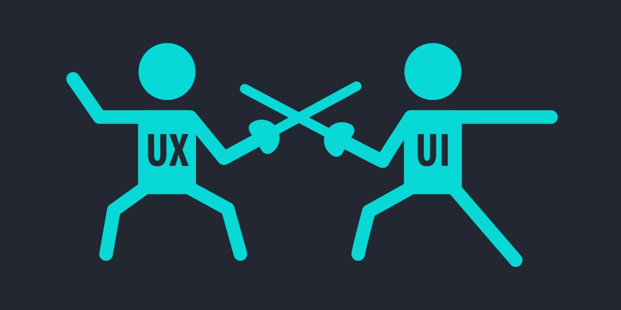
Ahat’s UX – I thought is was UI?
I was having this very discussion with an old friend of mine the other day. We both call menus, buttons, and windows “User Interfaces,” because that’s exactly what they do. Your UI provides a way for the player to interact with your shop, inventory, dialogue, file, options, and practically every other system you can think of. It’s one of the most important steps in your game’s design.
Anyway, my friend is a web designer – she said she had a teacher who would have slapped her if she heard her calling it “UI.” The correct term in this day and age is UX: User Experience. At first glance, it sounds like revisionists changing the name of a common concept so they can sell it as “new;” In reality, we’ve come a long way – and there are some important lessons to learn.
Bad UX
The best example of why you should pay attention to UX is in your car. Car manufacturers have tried for DECADES to design “infotainment” systems that are better than the apps on our phones / tablets. Most of the time, you ignore them, switch them to Bluetooth input, and use your phone. Why? It’s the User Experience…the menus are clunky, unresponsive, and organized in a way that only the guy who programmed them can find the controls.
Good UX
A good UI enhances the UX. Here are a few points I’ve kept in mind:
- Make it attractive. I modified a UI pack that I got from Humble Bundle. It fits the theme of my game, has color sets that coordinate, and was at the right resolution. If you don’t have art, use Unity’s simple UI elements, then hit up #2.
- Use Color Theory. There are a couple of incredible sites that can help with this. Palleton will let you customize a palette based on a color you choose – simple, effective UX color. If Palleton is a littleover your head, there’s an open source website called Flat UI Colors that has several researched and appealing pre-generated palettes. Go grab your colors, and start designing.
- Keep it Clean. Clutter bad; information at a glance good.
- Keep it Simple. Nested menus are soooo 1998. Code complex functionality into simple graphical buttons.
- Make it Easy. Obvious functions in obvious places. Don’t make your player wonder where a button should be.
An exmple of both:
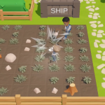
Here’s one of the menu screens I’ve been working on. I’ve refined this since I took this scrrenshot, as well as hooked up the code that makes it function. Also, don’t judge my prototype art harshly. You’ll want to click on the image to get a better view.
This window is the primary UX for friendships in Cownana. When you pause the game, you can tab over twice to reach it (inventory, map, friendships, options). The area on the LEFT lists all of the characters the player has met. I decided to use pictures with a simple relationship level display here because the player will easily recognize the person’s character portrait.

The good – Iconography
Check out the small photo in the LEFT side and the larger photo on the RIGHT. They are actually the same prefab in Unity. When the player clicks a photo on the left, the UX loads details into the pane on the RIGHT. Let’s focus on that big question mark, because it is actually some ingenious UX design.

Here’s a closeup of the portrait icon. The ? will be replaced by artwork – a portrait of the character that is displayed when the player talks to him / her. It’s animated: a simple eye blink and some eye movement (only on the larger “details” photo). I give the player the most needed info right there in the photo: Bottom left is the friendship level atop what looks like a white box. Eventually, that will be a heart. Using a script and a gradient, the heart changes color depending on the friendship level! The color goes from dark blue to yellow (universal color of friendship), and for marriage cadidates, up to a Valentine’s Day-worthy red.
The top will display a dating, engagement, or married icon to denote those statuses. Again, UX is all about giving information at a glance.
Bad Design – sort buttons
These are HORRIBLY complex. I already redesigned them, reducing them to 2 toggle buttons – one for “singles” that turns on / off; and a switch that clicks between “Local” and “Online.” With two clicks, the player can get the friendship list sorted in any way they like. Behind the scenes, there’s code that does all of the sorting and display switching. My first draft (shown here) has TOO MANY BUTTONS that don’t work in obvious ways.
Remember the User in UX.
Notice that I don’t put a bunch of complicated “sort by” items in the UX here. I thought about what the player was likely using this screen for – to see if Alisa’s level is high enough to ask her out, of course!! Players will find her face, see the color and level, the get right back to the game. If they forgot when her birthday was, or needed to make sure they’re giving her a gift that she’ll like…they click her face, and they see it!
The right information, seen at a glance, with simple controls. This is UX, folks!


